Lightspeed is a British fintech company providing fast, secure online payment solutions for small and medium-sized businesses.
Company
Self-initiated
Timeline
2023
—
2026
Role
Concept, 3D, Art Direction
Project overview
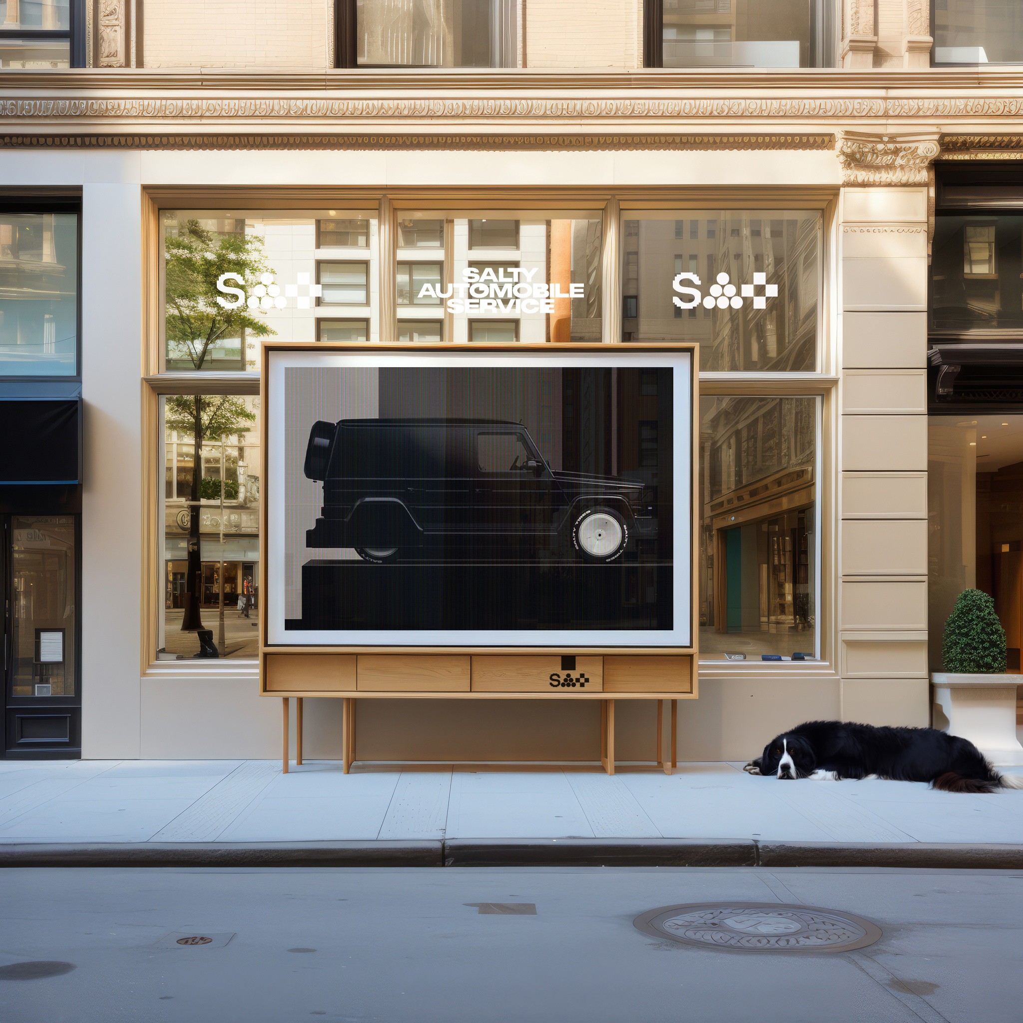
Right at the bottom: a greyscale drive test. No materials, no livery, no story — just the car rig moving through a scene to make sure the suspension, wheels and weight behave the way they should before any of the visual work goes on top. It's the least glamorous thing in the whole project and the most important. Everything above only works because the unsexy groundwork — rigging, motion, physics — was solved first.
Challenges
Designing for fintech always brings its own set of challenges. Lightspeed’s audience was split between small business owners with little technical background and developers who needed in-depth documentation. Catering to both groups meant balancing clarity with complexity. Additionally, the company’s existing identity relied heavily on generic stock visuals and outdated typography, which created a disconnect between their cutting-edge product and their online presence. The biggest challenge, however, was trust. In finance, every design decision—from color palette to micro-interaction—impacts how secure a platform feels. We had to craft a visual language that not only looked sleek but also conveyed reliability and transparency. Alongside this, there were technical hurdles: optimizing site performance for global markets, ensuring accessibility compliance, and integrating live payment demos without compromising speed or security.


Results
The redesigned Lightspeed experience launched with a strong, minimal design system centered around bold typography, a refined color scheme, and intuitive navigation. Small business owners now encountered a clear, jargon-free explanation of the product, while developers gained access to well-structured documentation and code samples. The addition of subtle interactive elements created a sense of speed without overwhelming the user. Post-launch, Lightspeed reported a 42% increase in signups within the first three months, alongside a measurable drop in bounce rates on key product pages. Feedback from clients emphasized how much more approachable and professional the brand felt. The project not only elevated their digital presence but positioned Lightspeed as a serious contender in the crowded fintech landscape—bridging the gap between innovation and trust.

Project overview
Right at the bottom: a greyscale drive test. No materials, no livery, no story — just the car rig moving through a scene to make sure the suspension, wheels and weight behave the way they should before any of the visual work goes on top. It's the least glamorous thing in the whole project and the most important. Everything above only works because the unsexy groundwork — rigging, motion, physics — was solved first.
Challenges
Designing for fintech always brings its own set of challenges. Lightspeed’s audience was split between small business owners with little technical background and developers who needed in-depth documentation. Catering to both groups meant balancing clarity with complexity. Additionally, the company’s existing identity relied heavily on generic stock visuals and outdated typography, which created a disconnect between their cutting-edge product and their online presence. The biggest challenge, however, was trust. In finance, every design decision—from color palette to micro-interaction—impacts how secure a platform feels. We had to craft a visual language that not only looked sleek but also conveyed reliability and transparency. Alongside this, there were technical hurdles: optimizing site performance for global markets, ensuring accessibility compliance, and integrating live payment demos without compromising speed or security.
Further Information
The redesigned Lightspeed experience launched with a strong, minimal design system centered around bold typography, a refined color scheme, and intuitive navigation. Small business owners now encountered a clear, jargon-free explanation of the product, while developers gained access to well-structured documentation and code samples. The addition of subtle interactive elements created a sense of speed without overwhelming the user. Post-launch, Lightspeed reported a 42% increase in signups within the first three months, alongside a measurable drop in bounce rates on key product pages. Feedback from clients emphasized how much more approachable and professional the brand felt. The project not only elevated their digital presence but positioned Lightspeed as a serious contender in the crowded fintech landscape—bridging the gap between innovation and trust.
Further Information 2
The redesigned Lightspeed experience launched with a strong, minimal design system centered around bold typography, a refined color scheme, and intuitive navigation. Small business owners now encountered a clear, jargon-free explanation of the product, while developers gained access to well-structured documentation and code samples. The addition of subtle interactive elements created a sense of speed without overwhelming the user. Post-launch, Lightspeed reported a 42% increase in signups within the first three months, alongside a measurable drop in bounce rates on key product pages. Feedback from clients emphasized how much more approachable and professional the brand felt. The project not only elevated their digital presence but positioned Lightspeed as a serious contender in the crowded fintech landscape—bridging the gap between innovation and trust.

Further Information 3
The redesigned Lightspeed experience launched with a strong, minimal design system centered around bold typography, a refined color scheme, and intuitive navigation. Small business owners now encountered a clear, jargon-free explanation of the product, while developers gained access to well-structured documentation and code samples. The addition of subtle interactive elements created a sense of speed without overwhelming the user. Post-launch, Lightspeed reported a 42% increase in signups within the first three months, alongside a measurable drop in bounce rates on key product pages. Feedback from clients emphasized how much more approachable and professional the brand felt. The project not only elevated their digital presence but positioned Lightspeed as a serious contender in the crowded fintech landscape—bridging the gap between innovation and trust.


Further Information 4
The redesigned Lightspeed experience launched with a strong, minimal design system centered around bold typography, a refined color scheme, and intuitive navigation. Small business owners now encountered a clear, jargon-free explanation of the product, while developers gained access to well-structured documentation and code samples. The addition of subtle interactive elements created a sense of speed without overwhelming the user. Post-launch, Lightspeed reported a 42% increase in signups within the first three months, alongside a measurable drop in bounce rates on key product pages. Feedback from clients emphasized how much more approachable and professional the brand felt. The project not only elevated their digital presence but positioned Lightspeed as a serious contender in the crowded fintech landscape—bridging the gap between innovation and trust.
Work in Progress
The redesigned Lightspeed experience launched with a strong, minimal design system centered around bold typography, a refined color scheme, and intuitive navigation. Small business owners now encountered a clear, jargon-free explanation of the product, while developers gained access to well-structured documentation and code samples. The addition of subtle interactive elements created a sense of speed without overwhelming the user. Post-launch, Lightspeed reported a 42% increase in signups within the first three months, alongside a measurable drop in bounce rates on key product pages. Feedback from clients emphasized how much more approachable and professional the brand felt. The project not only elevated their digital presence but positioned Lightspeed as a serious contender in the crowded fintech landscape—bridging the gap between innovation and trust.
Work in Progress II
Results
The redesigned Lightspeed experience launched with a strong, minimal design system centered around bold typography, a refined color scheme, and intuitive navigation. Small business owners now encountered a clear, jargon-free explanation of the product, while developers gained access to well-structured documentation and code samples. The addition of subtle interactive elements created a sense of speed without overwhelming the user. Post-launch, Lightspeed reported a 42% increase in signups within the first three months, alongside a measurable drop in bounce rates on key product pages. Feedback from clients emphasized how much more approachable and professional the brand felt. The project not only elevated their digital presence but positioned Lightspeed as a serious contender in the crowded fintech landscape—bridging the gap between innovation and trust.

